Page 1 of 4

World growth vs. Church growth

Posted: Wed Apr 04, 2007 2:04 pm
by _It occurs to me . . .
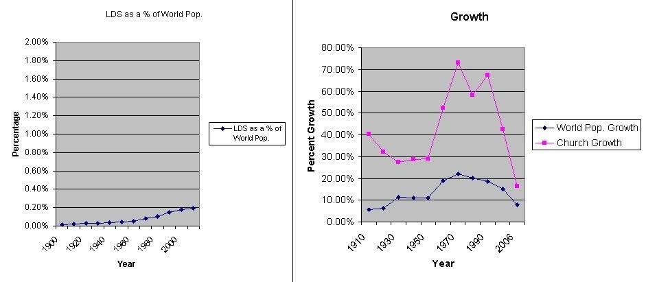
I made up this simple graph this morning to illustrate a point in a thread I was in over at MAD. I thought I'd post it here and ask for any suggestions to improve it. I'm definitely not a statatician, so I'm not sure of the best way to approach this. Also, if anyone has any good sites for world population estimates in 10 year increments between 1800 and 1900, I'd appreciate it.

The comment I included with this at MAD was:

I realize that it's hard to compare growth in millions to growth in billions, but nevertheless, it illustrates how the church continues to fall behind in comparison. Is this the stone cut without hands? Is this the best God can do in getting the message out to all his children? Don't you feel so special to be a part of this drop in the bucket that is the "one and only true church" on the face of the earth?


Image

Posted: Wed Apr 04, 2007 2:29 pm
by _Jason Bourne
It would work better to compare the percentage the church has grown to the percentage the wolrd population has grown. The graph you have is much to distorted to do a valid illustration.

Posted: Wed Apr 04, 2007 2:30 pm
by _Who Knows
What you should do is graph the LDS percentage of world population. Asbestosman has a similar graph, though he made his graph to look like the church is taking over the world.

You would just do it by taking total membership divided by world population. Then graph that number. I think it's around .002, or .2%, right now.

Posted: Wed Apr 04, 2007 2:50 pm
by _Who Knows
Oh, and what would make the graph even better, is if you put some other religions on there - Catholic, Islam, Scientology, Agnostic/Atheist.

Then you'd really get a feel for how they all stack up against each other in relation to worldwide population.

And do the same for JB's suggestion about church growth % vs. world population growth %. And throw those same religions on there.

Those would be interesting.

edit - if you have the numbers, i'd be happy to throw the charts together - wouldn't take more than a few minutes. I'm just too lazy to look up the numbers.

Posted: Wed Apr 04, 2007 3:54 pm
by _Sethbag
I'll have to go dig up the numbers and do them again, but I think I found that the world population growth right now was in the 1.4% or something like that range, while the LDS church's overall "membership" numbers over the last year had grown over 2%, so the LDS church was growing slightly as a percentage over overall world population. If you found the growth of active LDS compared to world population, however, their growth rate would be less than the world population growth rate.

Stone cut without hands indeed.

But, of course, you would expect some sort of response from the MADites about this, and I recall distinctly the last time this topic came up over there, and when it was demonstrated that the church was not taking over the world, someone responded with "we always knew the church would be rather small, it says in the scriptures most people would turn away from the Lord yada yada yada..."

So the LDS church is prophecied to take over the world, or it is prophecied not to take over the world, as required by the current statistics of the day. ;-)

Posted: Wed Apr 04, 2007 5:53 pm
by _asbestosman
Who Knows wrote:edit - if you have the numbers, I'd be happy to throw the charts together - wouldn't take more than a few minutes. I'm just too lazy to look up the numbers.


I forget where I got the numbers, but here are the ones I had:


year_ ____world___ church
1900 1,656,000,000 283765
1910 1,750,000,000 398478
1920 1,860,000,000 525987
1930 2,070,000,000 670017
1940 2,300,000,000 862664
1950 2,556,000,053 1111314
1960 3,039,451,023 1693180
1970 3,706,618,163 2930810
1980 4,453,831,714 4639822
1990 5,278,639,789 7761207
2000 6,082,966,429 11068861
2006 6,555,000,000 12560869

Current membership: 12868606

I may be off on the population thing depending on when the world counts their numbers (Jan 1 or Dec. 31).

Church vs world

Posted: Wed Apr 04, 2007 6:17 pm
by _asbestosman
The pessimistic graph (assuming census numbers for 2006 are estimated from Jan 1 2006)
Image

The optimistic graph (assuming census numbers for 2006 are for Dec 31 2006)
Image

Zion vs Babylon -- logarithmic graph

Posted: Wed Apr 04, 2007 7:01 pm
by _asbestosman
A logarithmic graph is most appropriate when dealing with exponential growth, hence:

Image

Edit: The previous graph didn't come out right for the last point. I have now fixed it.

Posted: Wed Apr 04, 2007 8:18 pm
by _Who Knows
Image

Who Knows

Posted: Wed Apr 04, 2007 9:00 pm
by _asbestosman
I appreciate having someone else make a graph, but you seem to have made a couple of mistakes.

The biggest one is that the last data point (2006) appears to be equally spaced from 2000 as 2000 is from 1990. Did you make the graph a scatter plot? I recently got dinged on that little mistake.

The second one concerns percentage growth. It looks correct except for the last one. Again, remember that 2006 is only 6 years ahead of 2000 instead of 10. To properly scale with the other decades, I think you need to use this formula:

100* ((2^ (10/6 * ( LOG(pop2006, 2) - LOG(pop2000, 2) ) )) - 1)

10/6 represensts the inverse of the fractional number of decades spanned.

I'll be happy to try explaining more if you want.

Look at it this way, if something increases 100% every year, how much does it increase in 10 years? The answer is 102300%.

Logarithms are key to get to answer for these sort of questions when we have varying intervals.